
Documentation
Templates, Modules, and Layout
Choose every customer tool, its navigation zone, contextual placement, opening behavior, and page portal.
A product template describes the customer workspace. It can be shared across product configurations without changing their product data.
Who this is for
Experience designers and WordPress integrators
What you will achieve
A reusable, responsive workspace where every module appears in the intended location and only when licensed and permitted.
Before you begin
- Know which customer tasks the product requires.
- Know whether the theme provides custom portal containers.
- Connect premium licensing and external providers before enabling dependent modules.
Create a product template
Where to go: Asuka Designer > Assets > Product templates
- Create a new template and give it a purpose-based title.
- Choose Standalone, Customer, or Admin mode.
- Open Template workspace and review Modules, Layout zones, and Portals.
- Save the template, then assign it to a test configuration.
Understand the module groups
- Creation and editing: Views, Designs, Text, Images, Shapes, Layers, Elements, Variations, Element editor, Drawing Areas, Marker, Colors, and Studio.
- 3D product tools: Product parameters, Materials, and Camera.
- Utilities and output: Zoom, Download, Magnifier, Ruler, History, State, Pricing, Pricing Rules, GLB optimizer, and License.
- Contextual tools: Font family, Text formatting, Text curve, and Transform.
- Image shortcuts: Upload, QR code, AI image, Pixabay, Pexels, and Facebook.
Tip: Search and filter modules by category. “Active only” is useful when reviewing a finished template.
Choose where a module appears
One enabled module may use more than one destination.
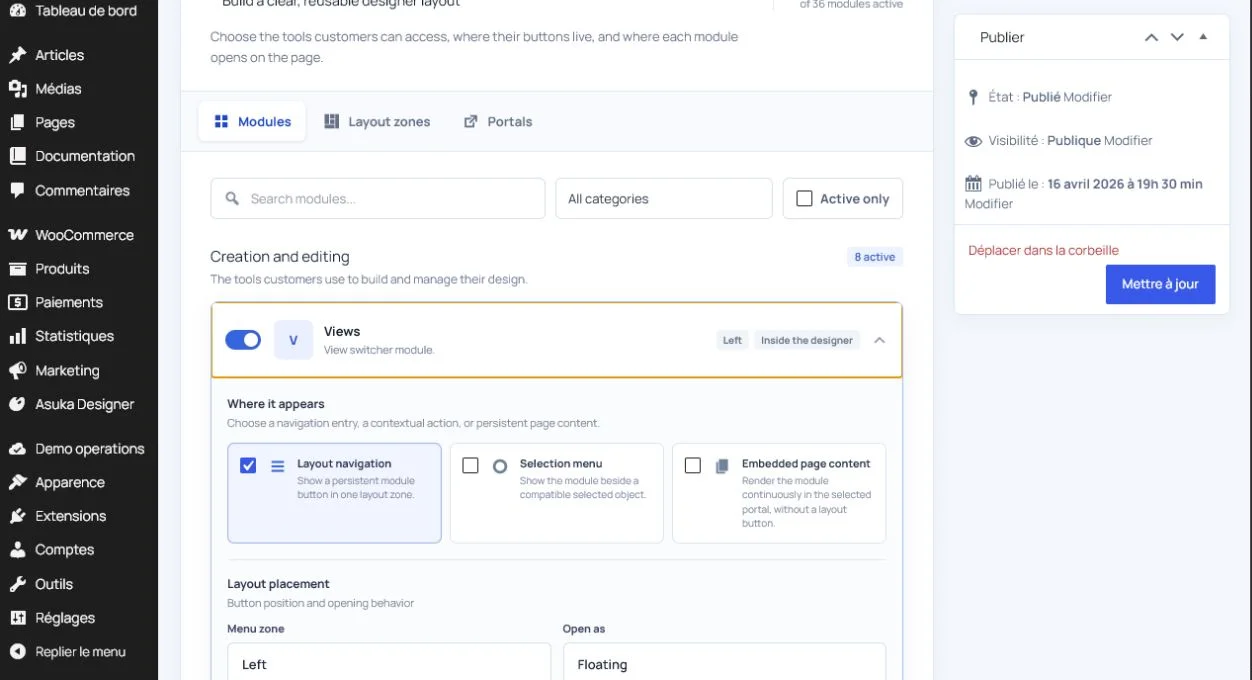
- Layout navigation: a persistent button in Top, Left, Right, or Bottom.
- Selection menu: a contextual action shown beside compatible selected objects.
- Embedded page content: the module remains continuously mounted in a page portal without a navigation button.
- A module may be in layout navigation and the selection menu at the same time.
- An enabled but unplaced module remains available to the API but has no customer entry point.
Choose the opening behavior
- Floating: an independent panel near the workspace.
- Popover: a compact panel anchored to the trigger.
- Panel: a panel using the selected layout zone.
- Modal: a focused overlay for larger workflows such as Studio.
- Inline: content inside the selected host.
- Drawer: a panel sliding from a screen edge.
- Overlay: content layered over the designer.
Tip: Use compact modes for frequent actions and modal/drawer modes for complex workflows. Avoid nesting large panels inside other cards.
Configure layout zones
Where to go: Template workspace > Layout zones
- Choose Default, Panels, or Inline behavior for each zone.
- Choose whether the zone starts collapsed.
- Choose whether the customer may collapse it.
- Keep creation modules together and utilities in a predictable zone.
- Preview narrow mobile widths before publishing.
Configure portals
Where to go: Template workspace > Portals
A portal is the HTML destination where a module panel or embedded module is mounted.
<div id="asuka-product-tools"></div>- Inside the designer: use the plugin-managed workspace.
- Shared page portal: use one selector shared by several modules.
- Document body: mount under the page body when appropriate.
- Custom CSS selector: target a dedicated theme or page-builder element.
Tip: A dedicated ID or data attribute is safer than a selector based on a theme’s internal WooCommerce classes.
Handle portals rendered later
WooCommerce blocks and page builders may create the destination after the designer initializes.
- The plugin observes the page and mounts when the selector becomes available.
- Keep the selector stable between desktop and mobile templates.
- Do not target an element that is repeatedly destroyed and recreated during normal interaction.
- Test a hard reload, variation change, AJAX fragment refresh, and mobile layout.
Success check: The module mounts once in the requested host and never falls back into the designer menu after the host appears.
Respect licensing, integrations, and permissions
A template cannot force an unavailable module to load.
- Core modules are available when their permission is enabled.
- Premium modules require the signed feature and matching add-on chunk.
- Provider shortcuts require both the entitlement and the configured provider credential.
- 3D-only modules remain irrelevant until a 3D view is active.
- Locked or setup-required badges explain why a module cannot be enabled.
Need to verify the result?
Run Asuka Designer > QA & Diagnostics, then repeat the customer workflow in a private browser window.